ADA Challenge 2: The coffee Shop App
Small Start, Realistic Application
〰️
Small Start, Realistic Application 〰️
For challenge 2 of the Apple Developer Academy, the task was to create cohesively branded coffee shop app for an assigned store in a 4-week guided sprint.
SPKRBOX—The Brand
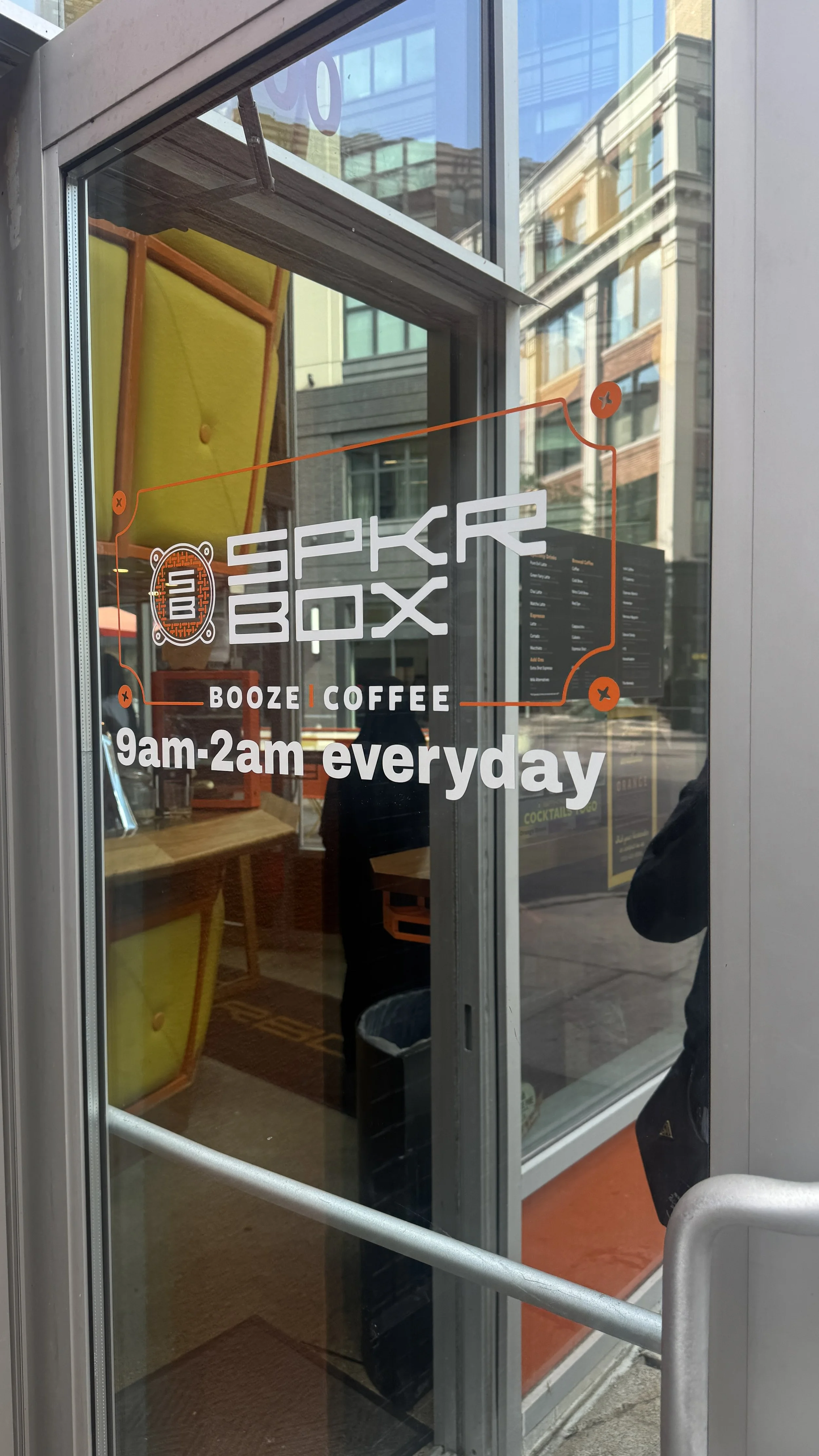
I was one of the learners assigned SPKRBOX. SPKRBOX is high-energy, modern, clean, and music-inspired cafe with a DJ booth and reputation in Downtown Detroit’s nightlife.
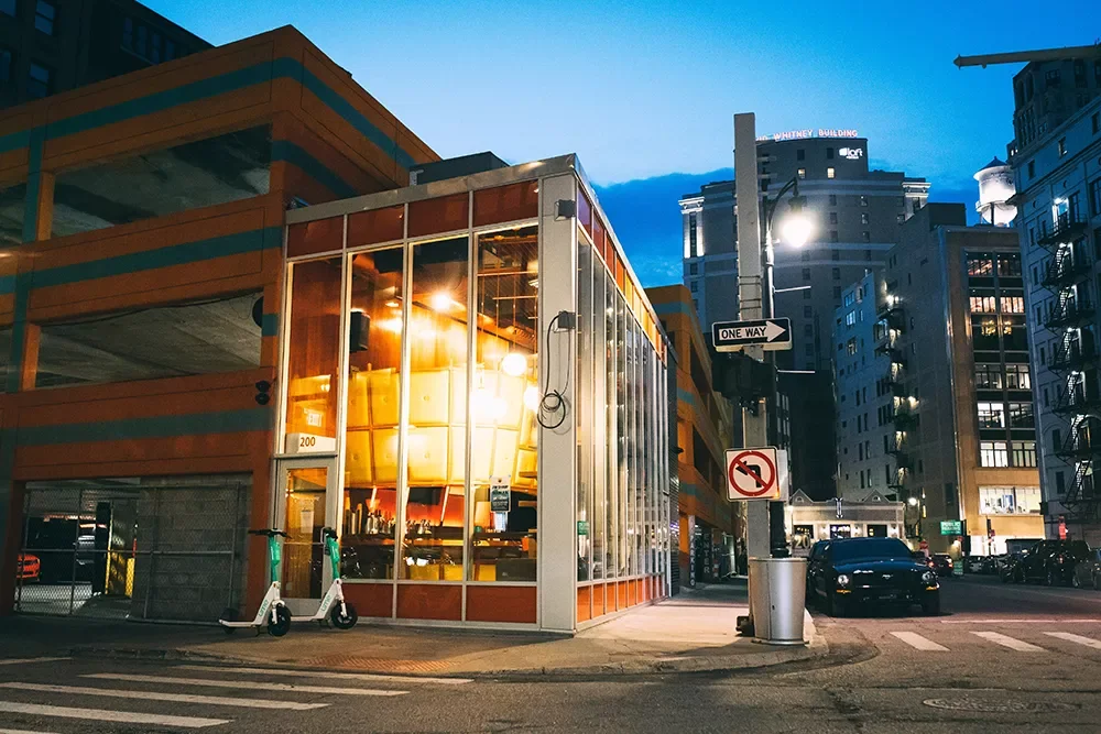
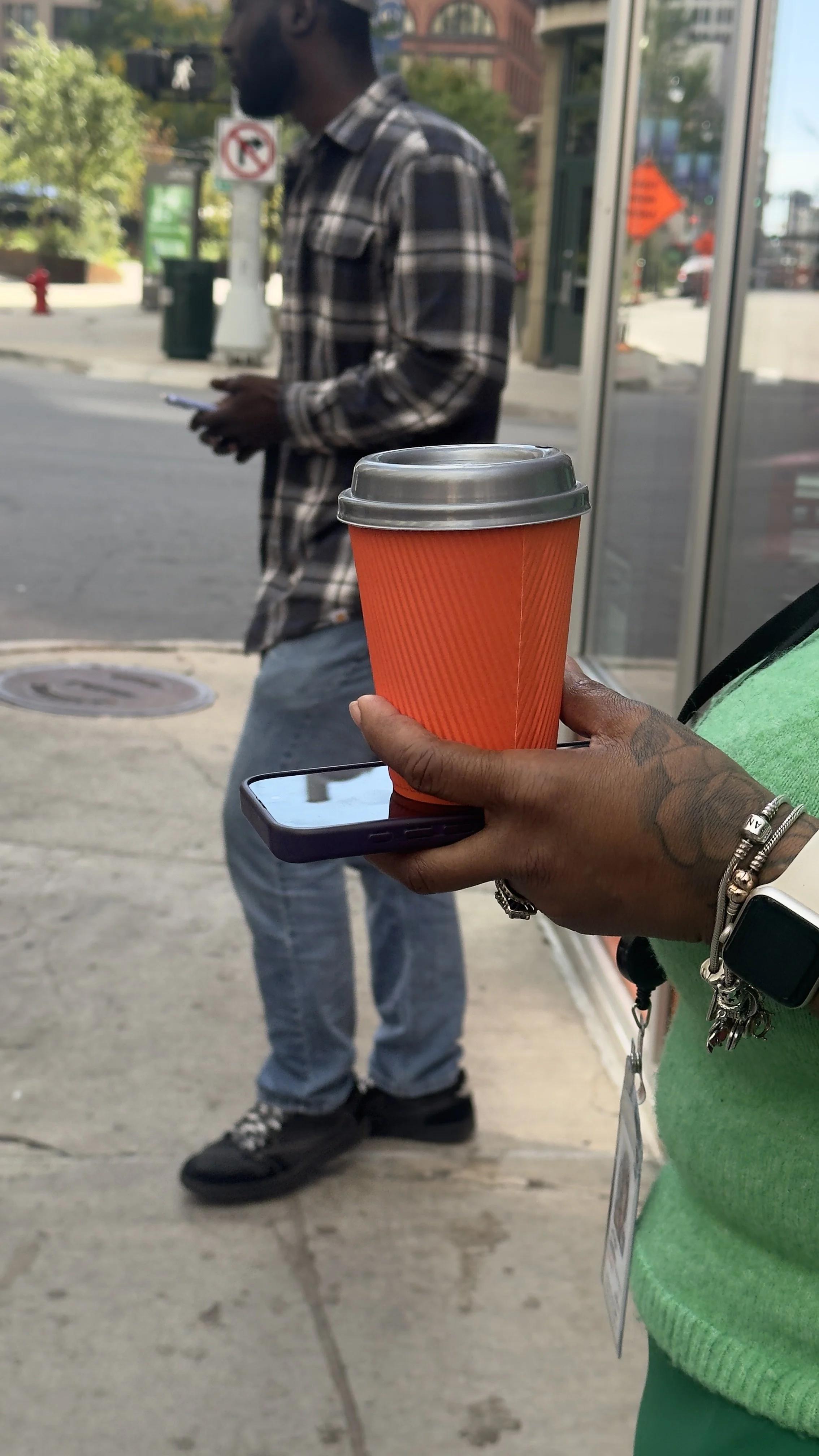
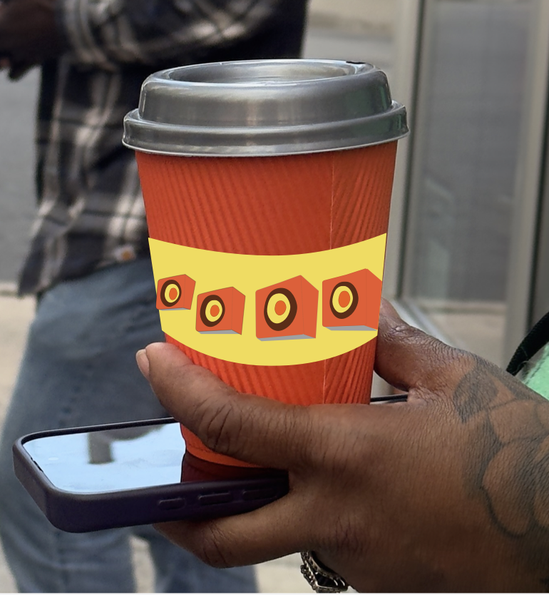
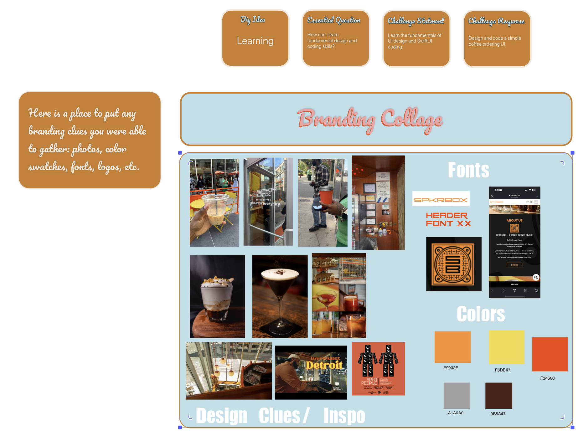
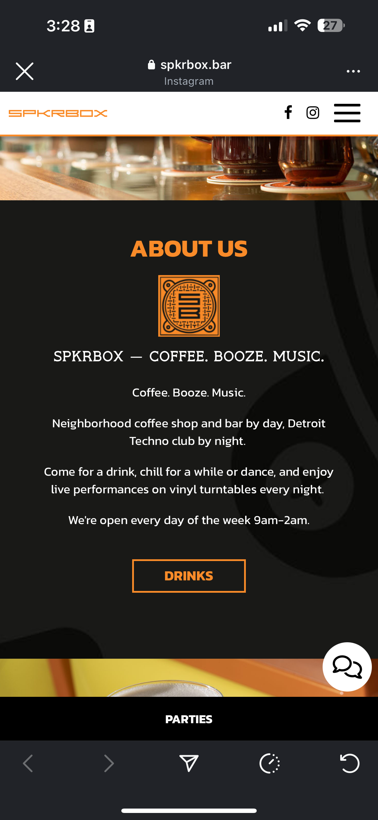
The first step was to research the brand and compile a branding collage to inform the app’s design. I spent about two to three days exploring the location, their website, and social media, examining their design choices down to the smallest details like cups, furniture, and kinds of napkins they use.
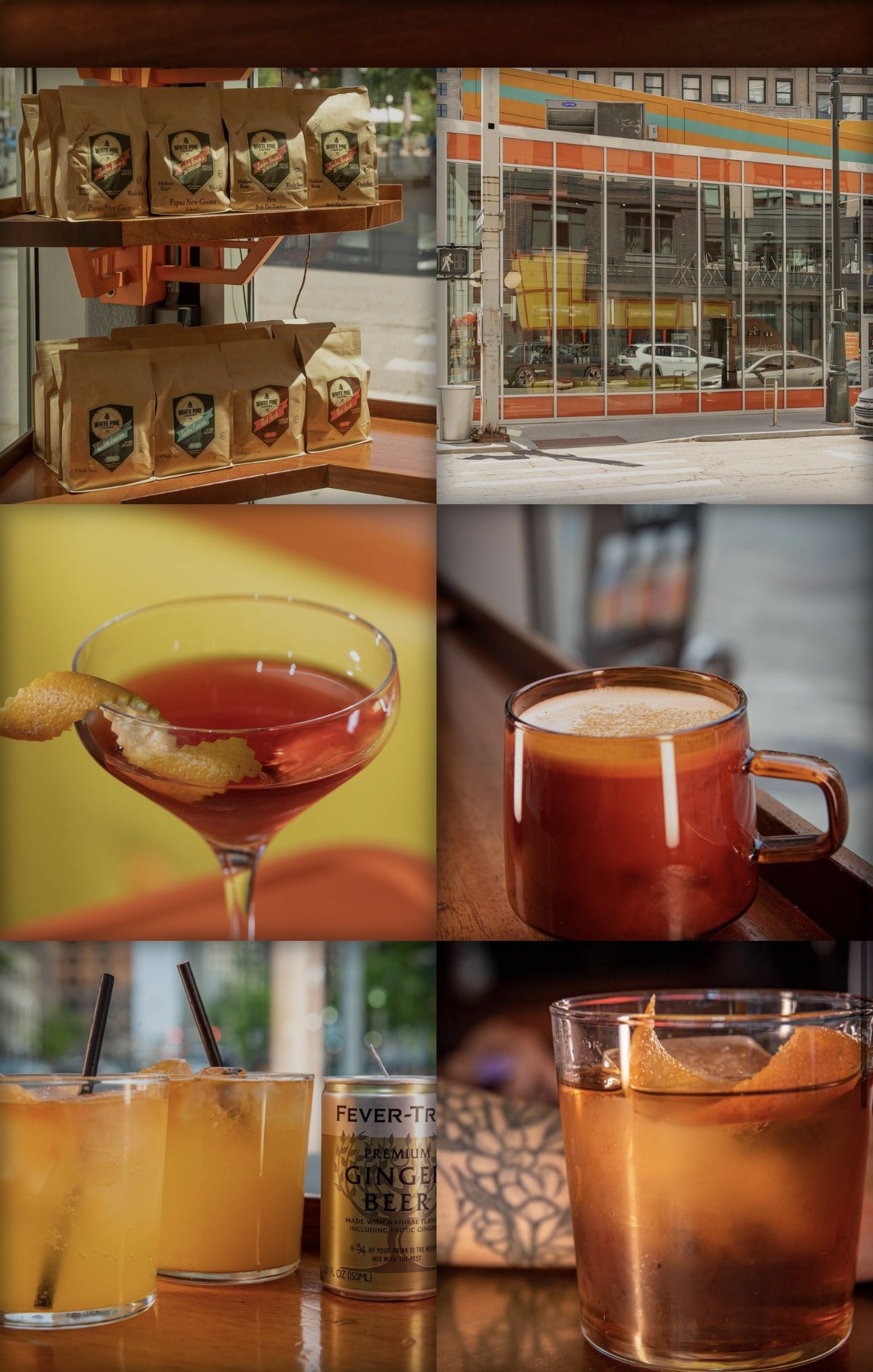
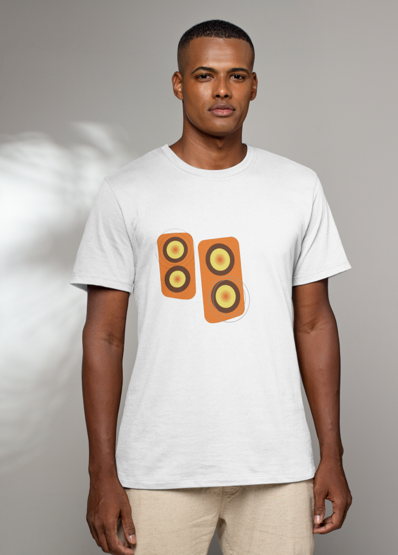
Take a look at other materials I was able to conceptualize beyond the app below.
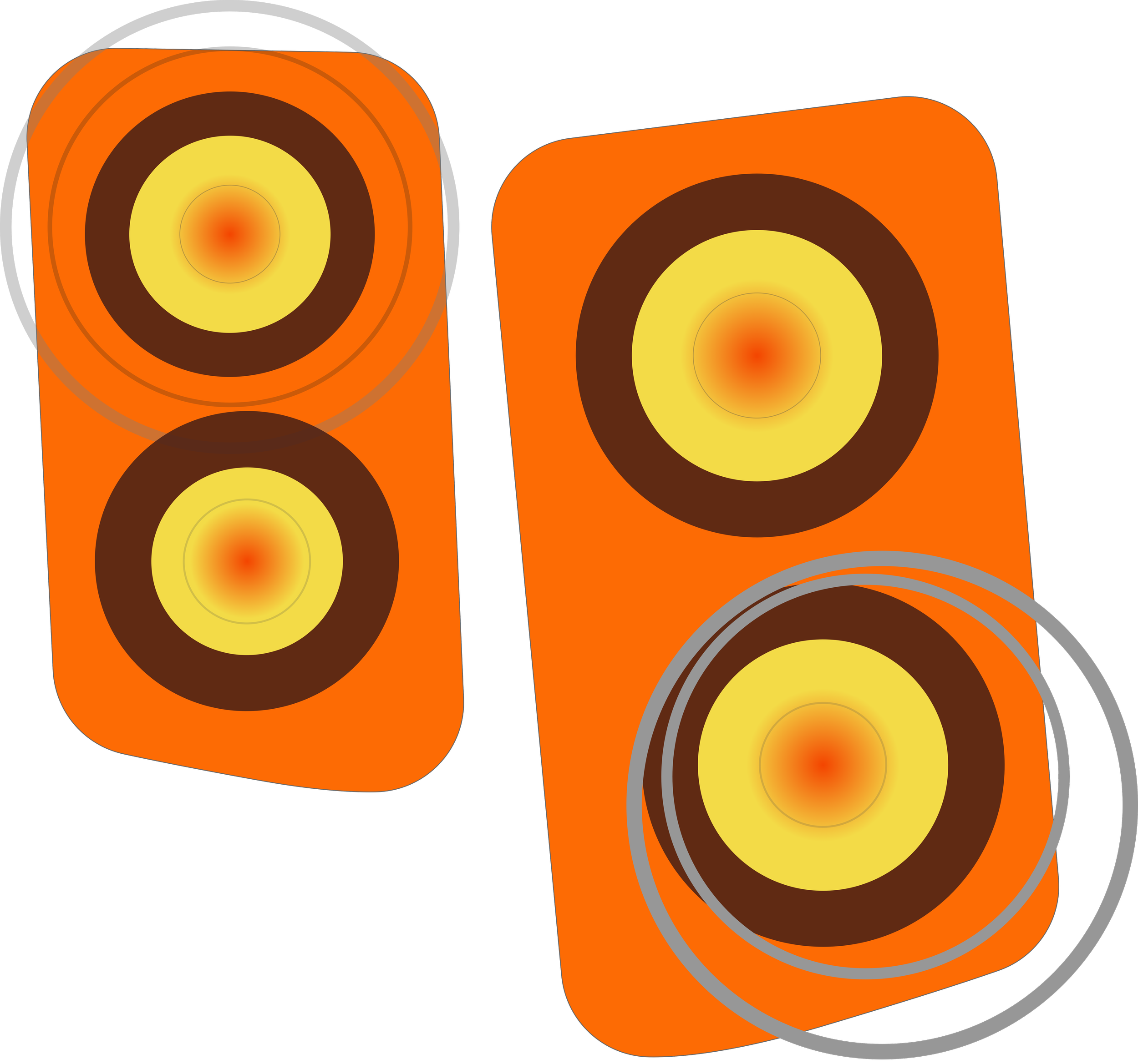
By the end of my research I had a branding collage complete. This informed not only the app’s design but also the branding possibilities for merchandise and visual assets.

Launching the Design Process
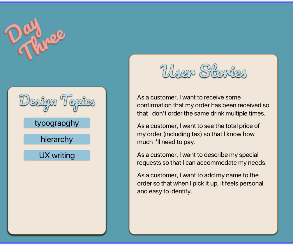
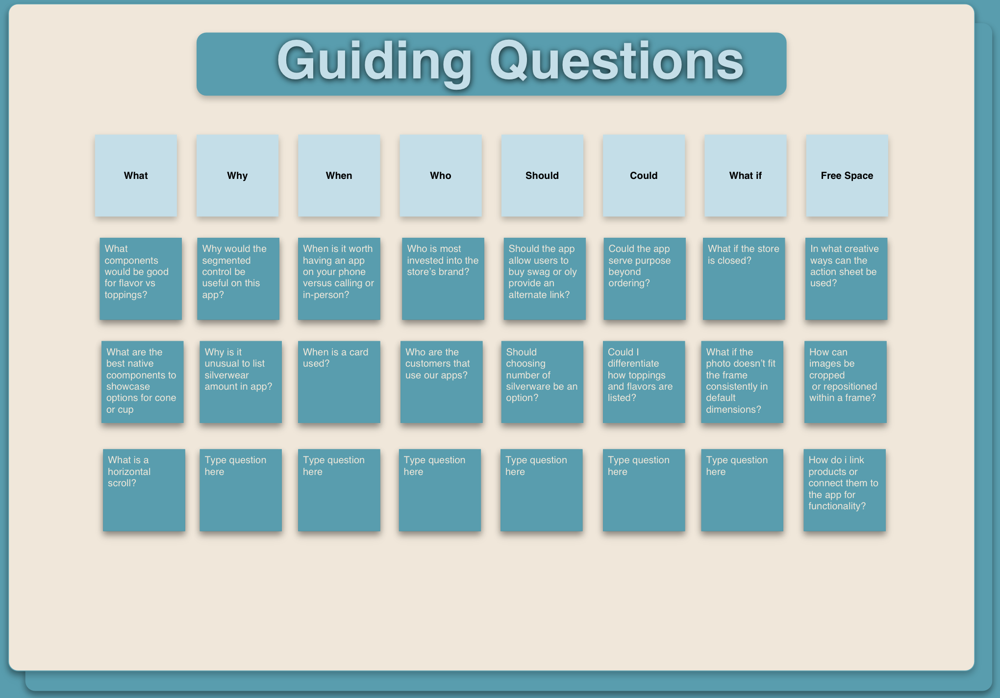
Throughout the week of Lo-fi design, I was tasked with creating solutions for various user stories in order to determine core app features while learning daily design topics. I created guiding questions from the user stories that helped me think critically and research design solutions (application features) and what guiding activities to engage in to answer each question and sequentially find and implement those solutions. This process ultimately provided me with actionable steps I could take to design the app’s core features.
The Lo-fi Wireframe
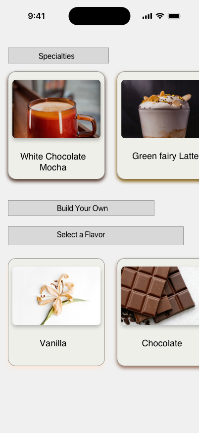
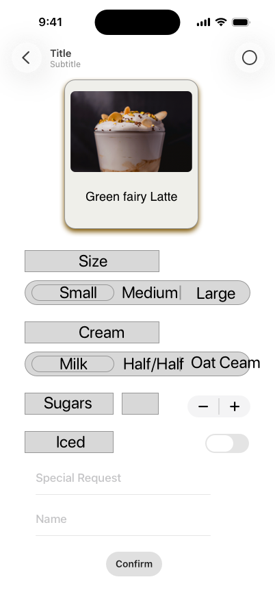
Using Sketch, I created a Lo-fi wireframe of the SPKRBOX app with some guidance from my mentors. I referred to apple HIG and researched some basic principles and tools of design like grids and columns. I designed a horizontal scrollview to navigate through the lists of drink options.
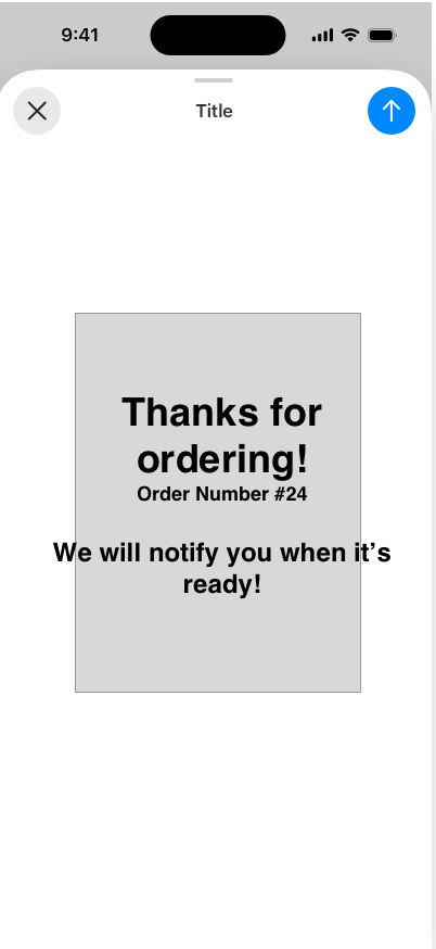
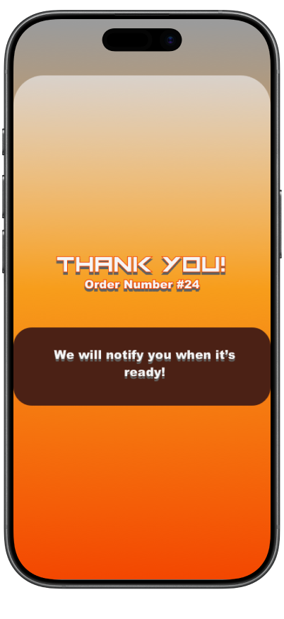
I also used the Apple HIG to choose components from the Apple UI Toolkit and maximize their effectiveness. For example, I designed a sheet that slides up to confirm and notify customers the moment that they submit an order.
The Final Design
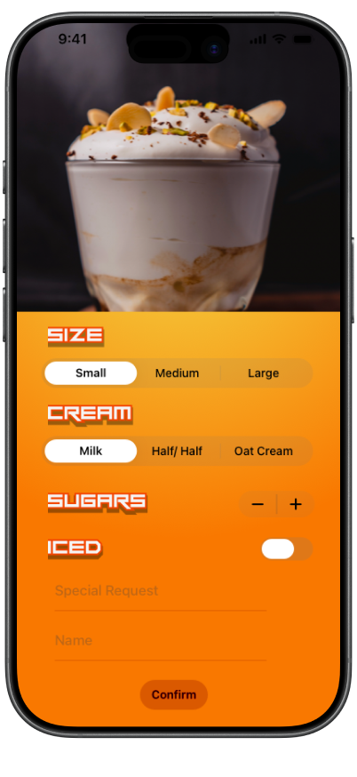
After the final iteration of my lo-fi and receiving feedback from my peers, I experimented with fonts and ways to incorporate the brand colors so that the hi-fi feels like an extension of the SPKRBOX store. Below you can see my final hi-fi and an explanation of each UI component.
Sugars Stepper: A stepper is available for users to choose how many sugars they would like added to their drink.
Special Request Text Field: The customer can add any additional notes for how they want their item prepared. It allows them to do things like asking for notes, extra napkins, extra straws or where to put toppings.
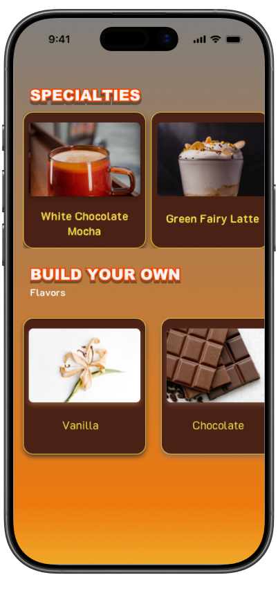
Specialty Item Cards ScrollView: a collection of specialty drink cards that can be explore by swiping left and right. The user simply taps a card to select the drink.
Build Your own Flavor Cards ScrollView: a selection of flavors for the user to choose from as the base of the drink they want to build. This scrollview can be explored left and right also.
Drink customization: Users can specify how they want their final drink prepared from size to creams and ice.
Size and cream: The size can be chosen from small to large using a segmented picker. The type of cream can also be chosen using the same kind of component.
Ice Toggle: This component allows users to toggle whether they want their drink iced or not.
Name Text Field: The customer will submit the name of their order so they or staff can recognize it when picked up.
Confirmation Sheet: Upon submitting their order, users wi9ll be met with this confirmation sheet so that they know the order is being prepared.