
Ryver City Party:
A journey of revision in tvOS Game Design
Brief
This case study highlights the initial goal of creating a unique game leveraging tvOS and how it evolved into a more clear, cohesive, and captivating game concept in two development cycles. I worked at the Lead UX Designer and Project manager for both development cycles.
Ryver City Party—a 4-player virtual party board game for tvOS.
Introducing the first iteration of
On a Detroit inspired map, four players compete from the perspective of their chosen characters, rolling dice and battling in trivia and a mash up of taboo and charades. When players roll, it’s a game of luck and strategy to see who wins the most Moto-bucks. The final winner earns their character a pair of “buff” glasses.
We chose tvOS because we wanted family and friends to enjoy a fun gaming environment on a big screen similarly to consoles.
Query Combat
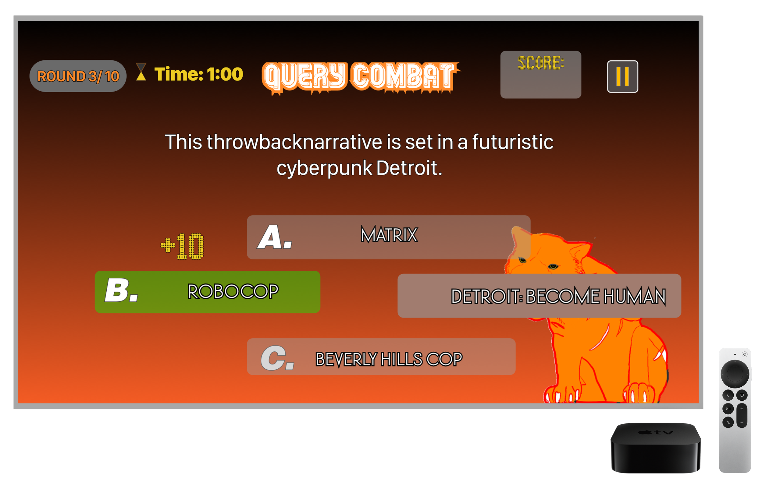
Building on what the team collectively decided we wanted the core experience of our game to be, I crafted the experience and visual asset for Query Combat— a family feud-inspired trivia mini game.
We found that, while we can use iPhones as additional remotes, they would all function as the same controller. This meant they could be used asynchronously but not simultaneously as players could control other players remotes even out of turn. As a workaround I came up with the concept of buzzers to regulate players to one turn at a time. The player who hit their assigned buzzer gets to answer the question and all others must drop their remotes.

Mimics & Mystery
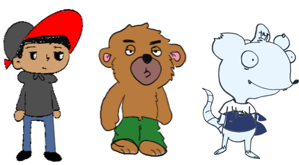
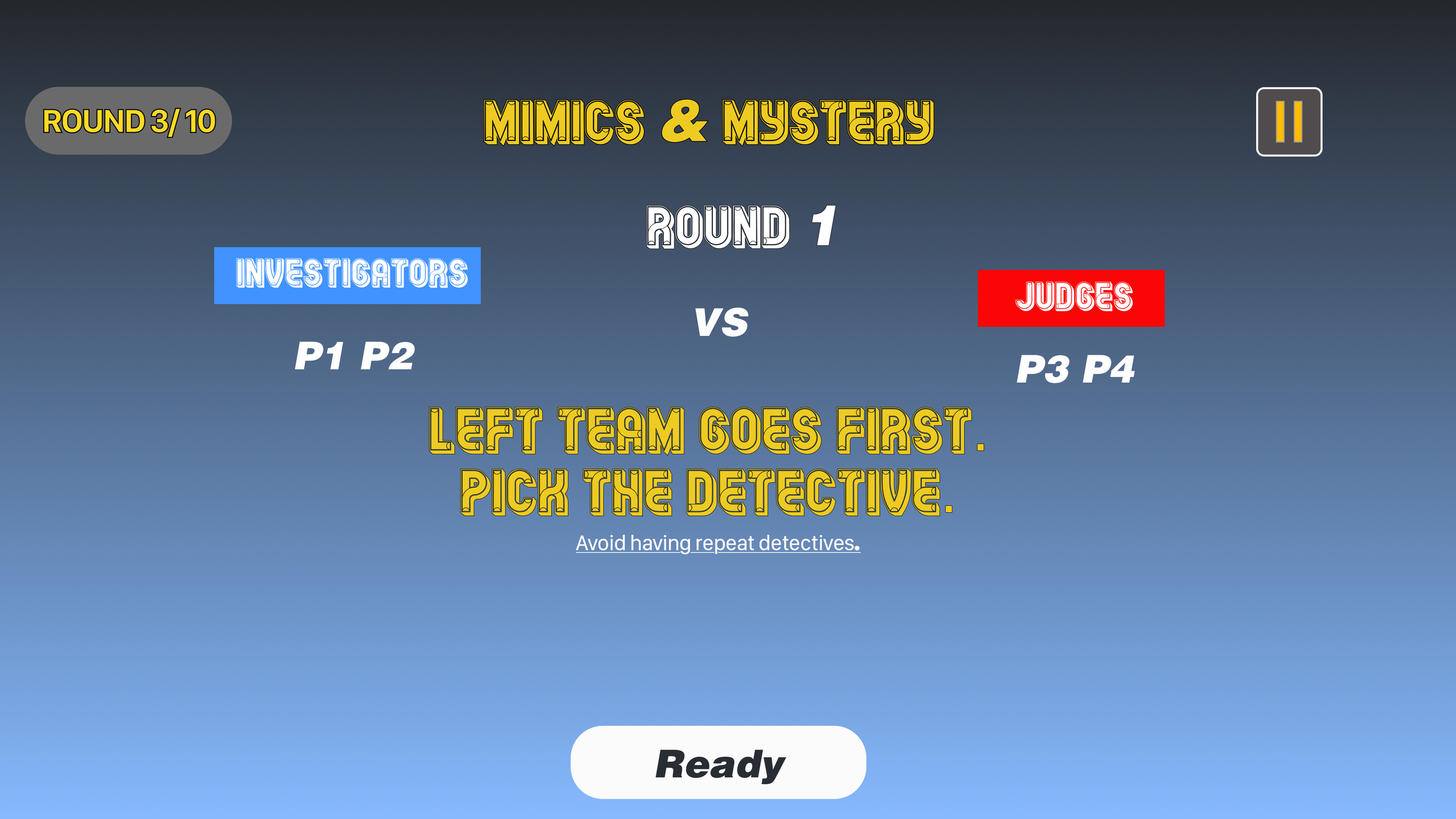
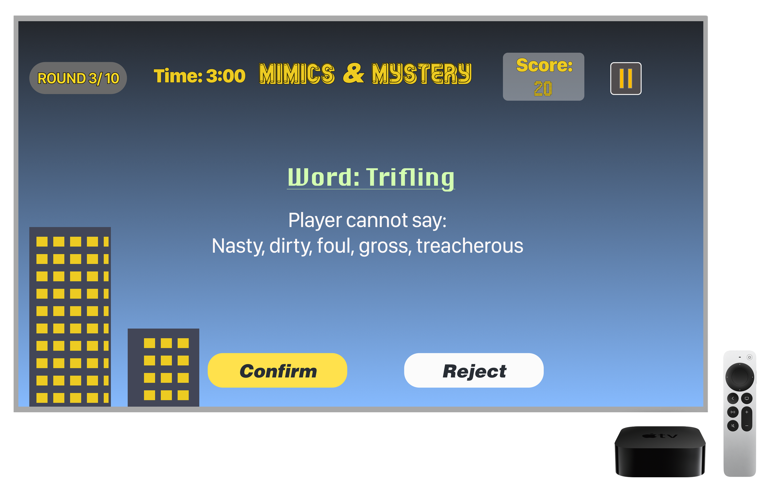
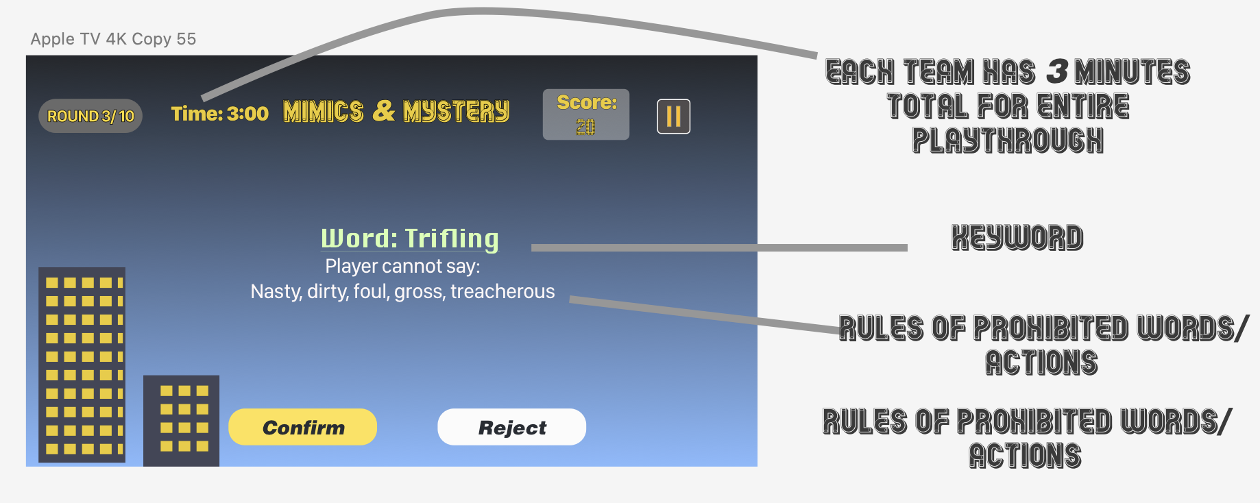
Mimics & Mystery is a taboo and charade’s inspired guessing game where a detective uses their partner’s hints to guess keywords. While Mimics & Mystery is fairly simple in design and requires less code than Query Combat, the directions for users to follow made up for it in time and attention to detail. I was responsible for that as I designed the rules and wrote the user guide for playing the game properly.
Character Selections
With my direction, my co-designer created character models for players to choose from. This would provide fun options for players to decide how they play the game.
Map and Hero Assets and Foliage
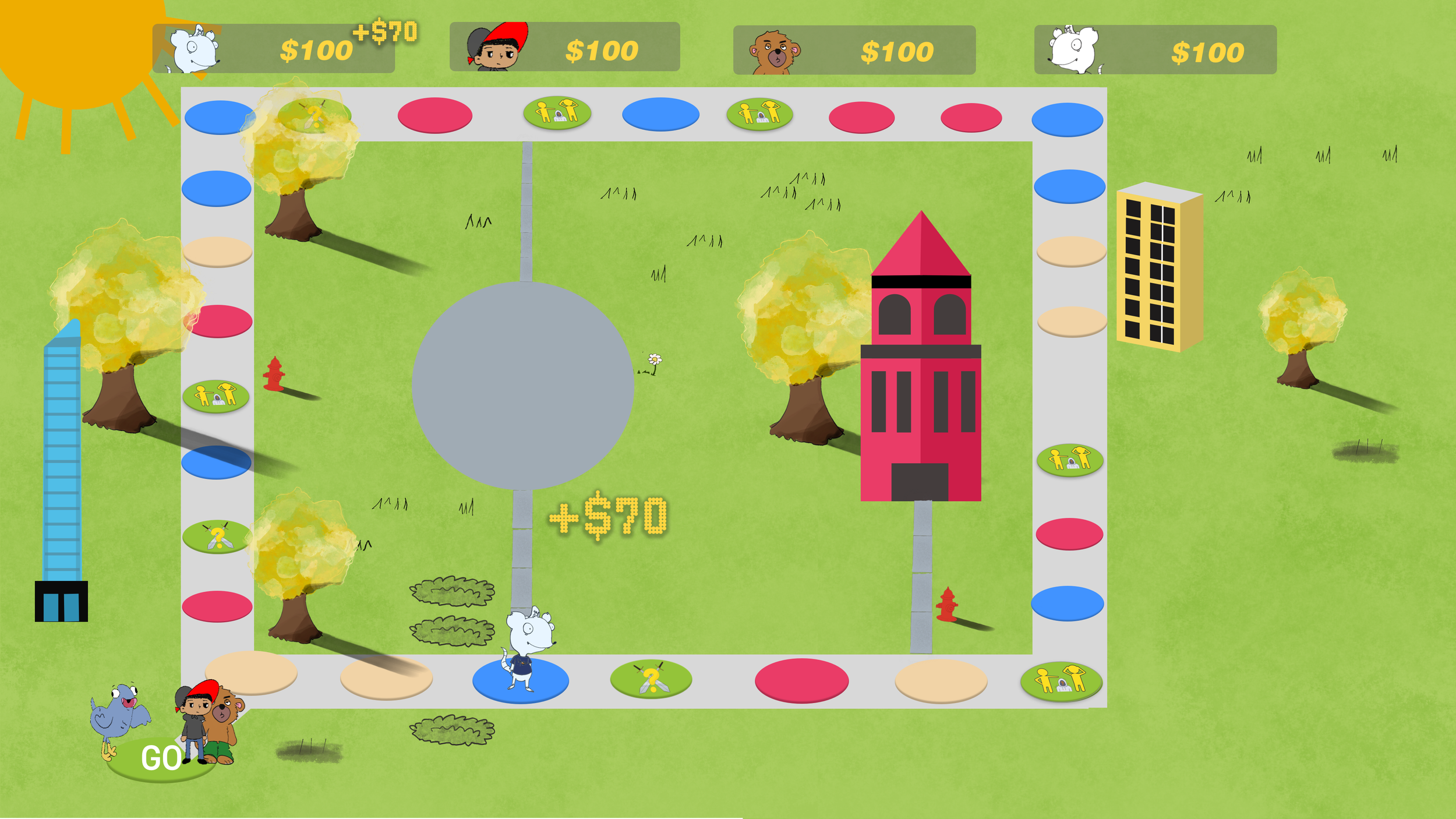
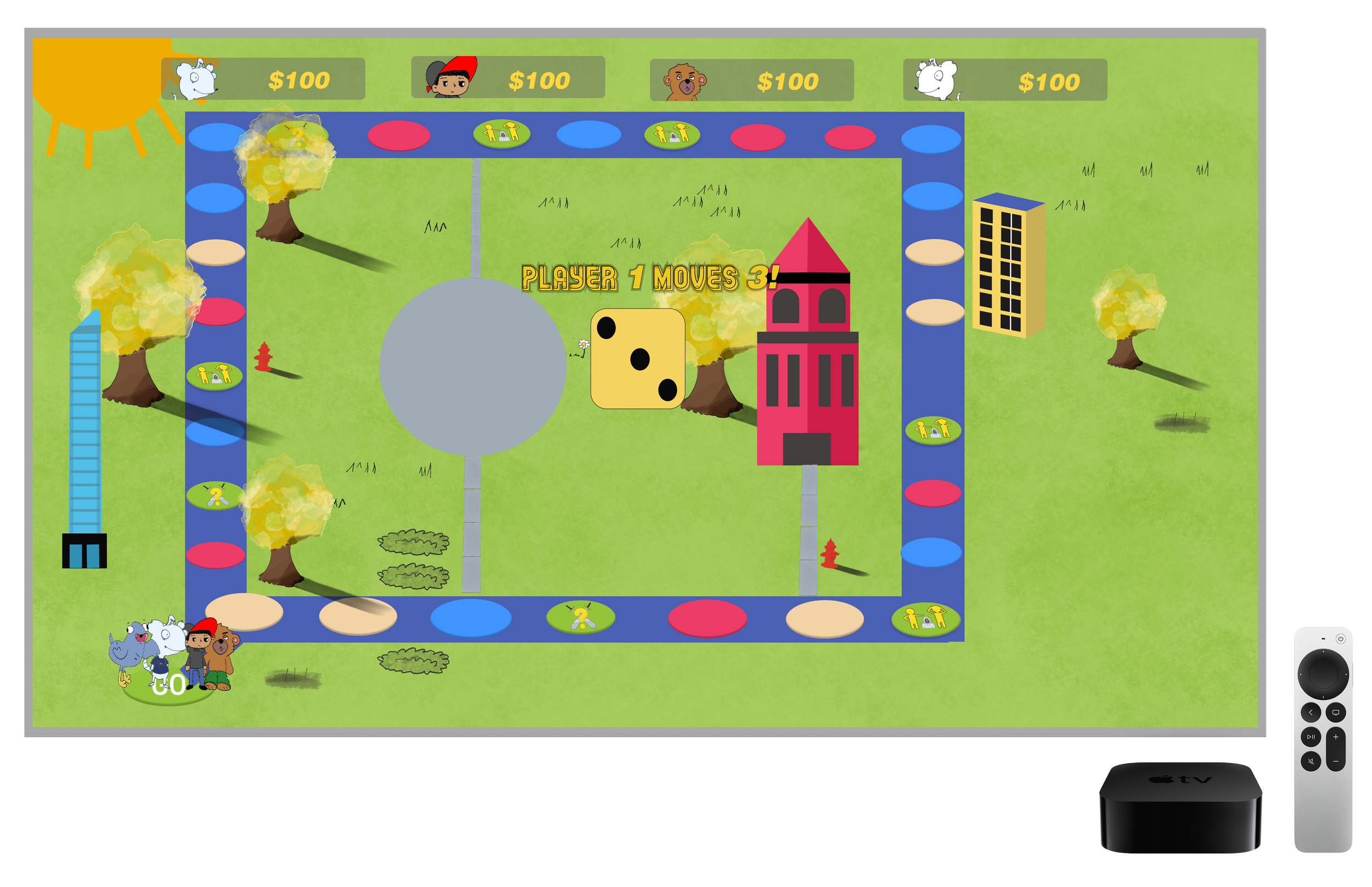
The first iteration of RCP featured a small geometric map and focused on core game mechanics that would be carried over or refined in the second iteration. Foundational components that we kept for round 2 include:
Insights and Feedback
The first iteration of Ryver city Party was a success. My team at the team did our best and fulfilled the requirements of the Apple Developer Academy’s challenge. However, when I carried the idea over to my new team, Pathos, we conducted research and found some valuable data and feedback that would take the game to the next level.
The Map and Theme
The map captured the spirit of RCP in the mini games but lacked the immersion, mechanics, and familiarity for Detroit’s and Metro-Detroiters to holds onto. My team found that players would get tired of the mini games alone and felt there were too few ways to impact the game. The party element of the game was also lacking features that made players feel like they had autonomy and subsequently did not fulfill their desire to affect each other’s experiences.
The landscape also didn’t give the impression of an urban industrial city like Detroit.
The Characters
The character designs were fun and creative but did not fulfill the vision of immersion in a Detroit-centric world. The animal based designs felt out of place and did not lend themselves to the brand.
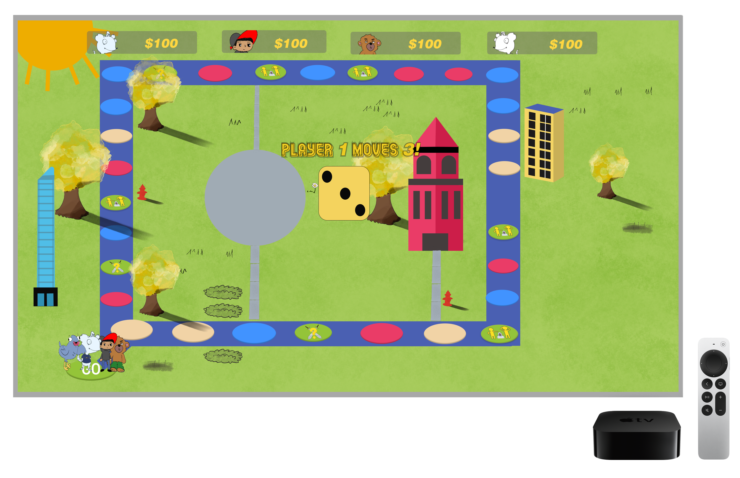
The Second Iteration of RCP
The New Map and UI
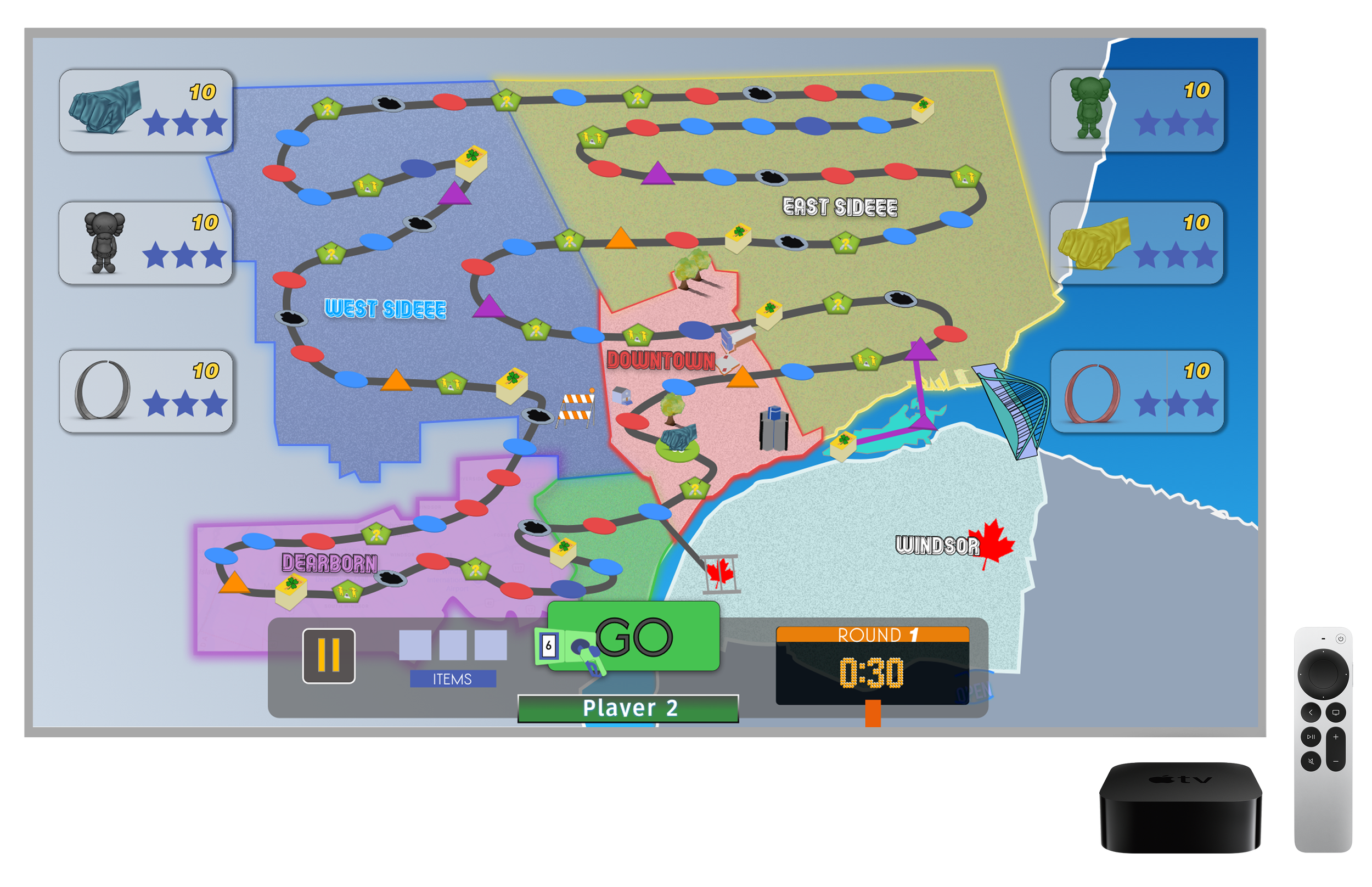
After a series of user testing, research, and brainstorming, my team Pathos made significant strides non reimagining what the map and in-game screen could be.
We wanted players to feel familiar with the map in how they recognize it, so we labeled the different regions within Metro-Detroit like the East Side, West Side, Southwest, and Dearborn.
We were presented with the idea of making a sardonic take on Detroit which informed new mechanics like potholes and explanations of old ones like red spots, which are now known as “pay to park spots.” We also played up unique Detroit experiences like accidentally going to the Canadian border as a prompt within the chance card mechanic, which results in players being detained in Windsor for multiple turns.
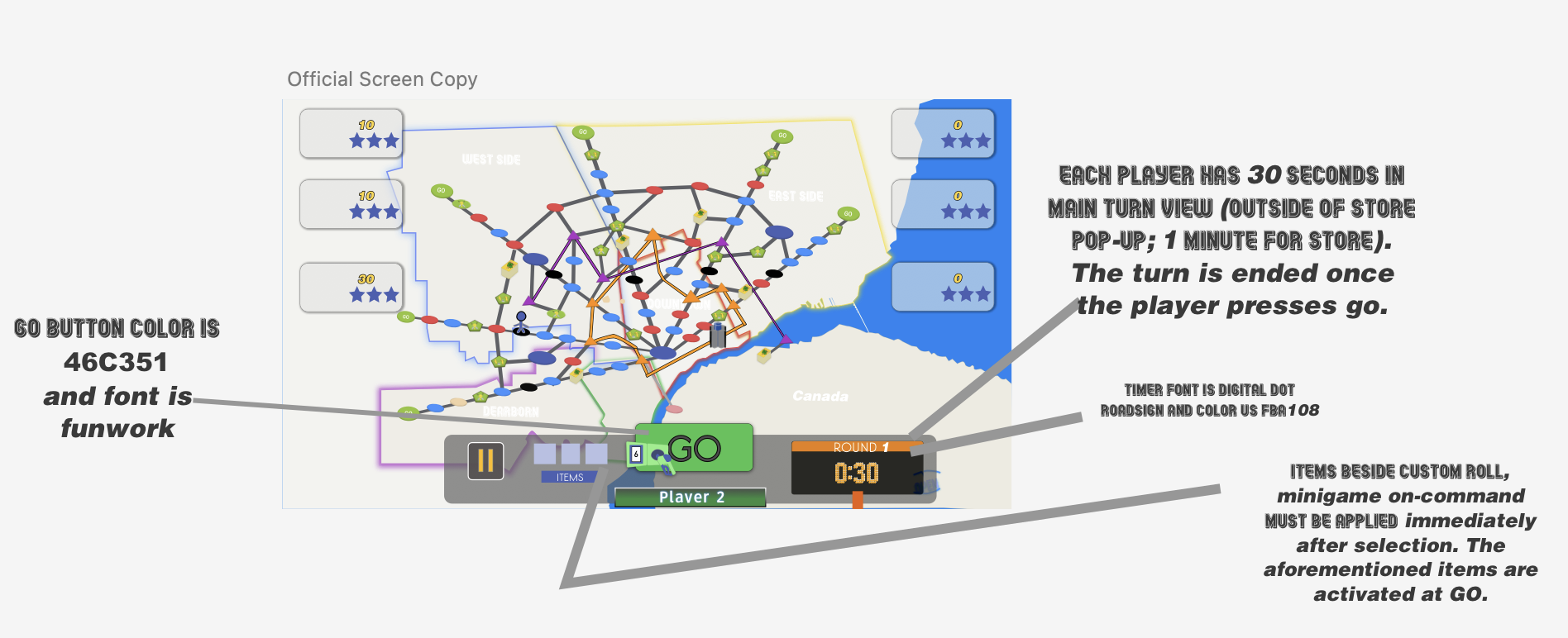
I also designed a bottom UI panel taking inspiration from Detroit’s Motor City identity by using a gas gauge for indicating players’ distance for movement and an illuminated traffic sign to limit the time of each turn. Originally dice would be used for generating player movement but I pivoted to a gas pump for user recognition.
The first time around laid the foundation of what RCP could be but lacked the scale and branding. I lead my second team, Pathos, in creating a more robust, Detroit-centric gaming experience that featured mechanics that added layers to the game that made it comparable to franchises like Mario Party.
Minigames: Query Combat and Mimics & Mystery
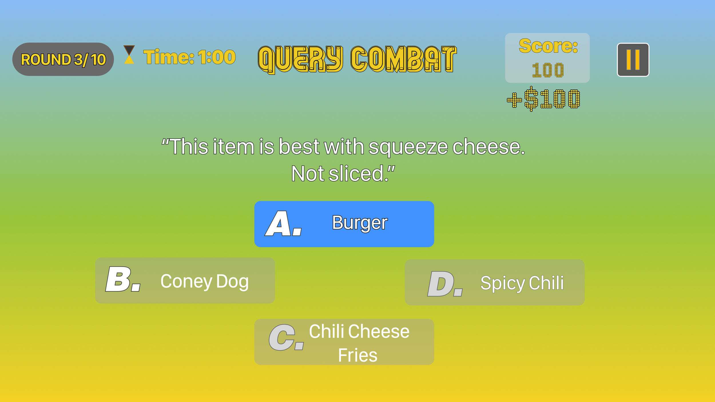
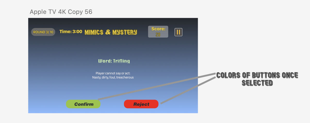
To make the feel of the game smoother and more familiar I revamped the UI of the mini games. I made Query Combat Detroit Tigers themed and added visual assets to Mimics & Mystery.
We also changed the functionality of the mini-games so they were more feasible for developers. instead of using a buzzer feature, Query combat became a one-player high score style game but Mimics and Mystery remained a team based game. Based on user testing I readjusted the allotted time for Query Combat from two minutes to one minute and Mimics and Mystery from five minutes to three minutes.
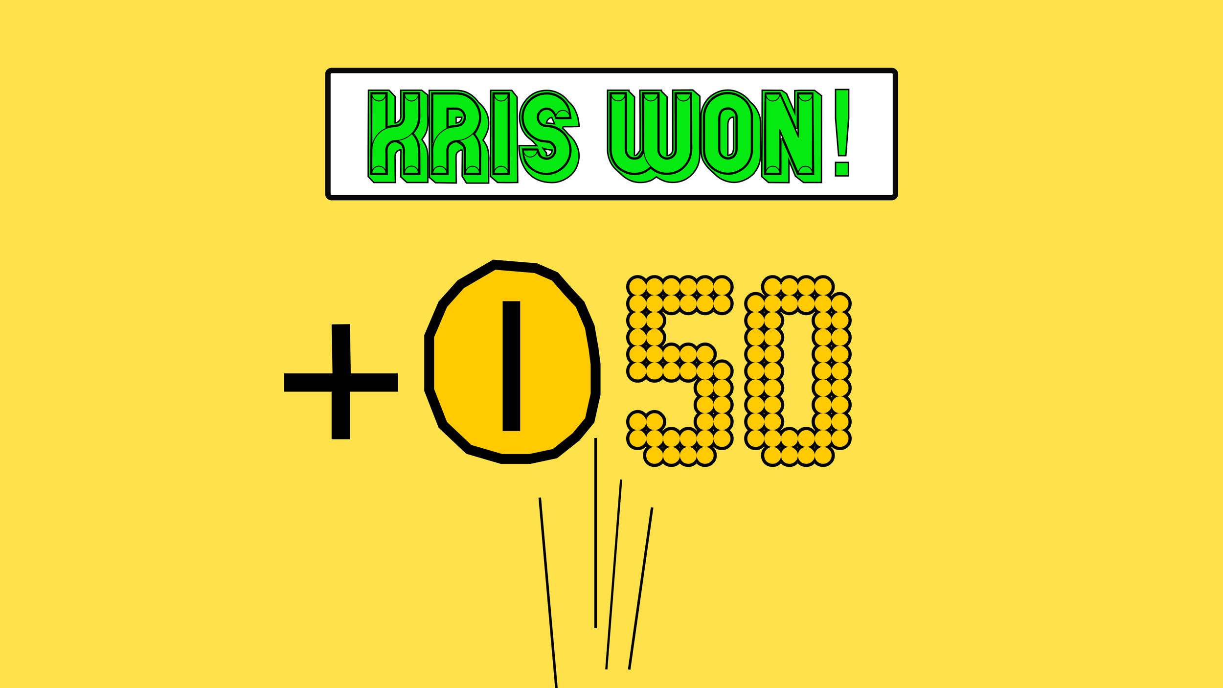
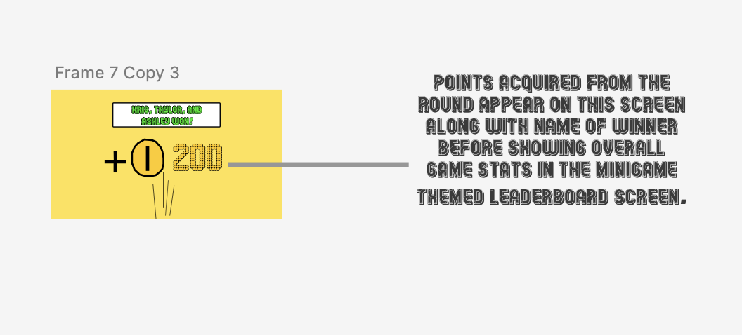
I also added a “winner” screen to notify players who won the minigame once the timer has ended.
Map Spots: commute spaces and chance deck
To make the game more engaging, I conceptualized two new mechanics for the map: the commute spots and chance spots. The purple spots known as commute spots allows a player that lands on one to skip to another commute spot in the same turn instead of relying on a randomized number of spaces in the gas gauge.
When a player lands on the chance spot, a card is automatically drawn with a prompt that can punish or reward players via points or moving them around the map.
New Characters/Pieces
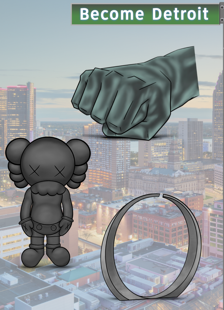
To further inject the Detroit feel of the game, we pivoted from the original character models to pieces modeled after recognizable Detroit monuments like Joe Louis fist and the Spirit of Detroit.
The Corner Store
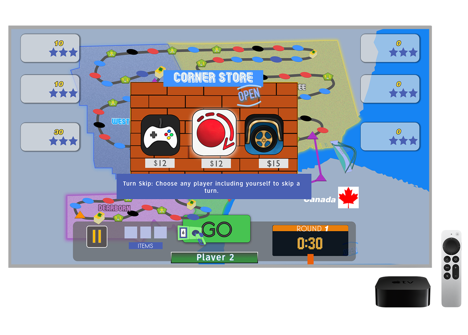
Bodegas are a part of everyday life in everyday Detroit. It’s unlikely to drive down a busy road and not see a bodega or liquor store that sells food and household items. We considered that fact when we designed the Corner store system that allows players to buy items to gain an advantage in the game.
We made fun and strategically effective items like the “black suburban” that grants immunity to potholes, the “turn skip,” and the “game on command” so players can initiate games on a whim rather than landing.
My Roles
Product Manager
Using Miro, I directed the ideation of our project and assigned tasks to the coders and designers based on their strengths and preferences. I steered the conversation of the product features and UVP and monitored the progress of project tasks, while keeping my team on track using backlogs and scrums to deliver a cohesive gaming app. See examples of my contributions below.
Game Design Document

As the project manager, I refined and documented the smaller details of our game like the rules, the mechanics, and the
Ideation
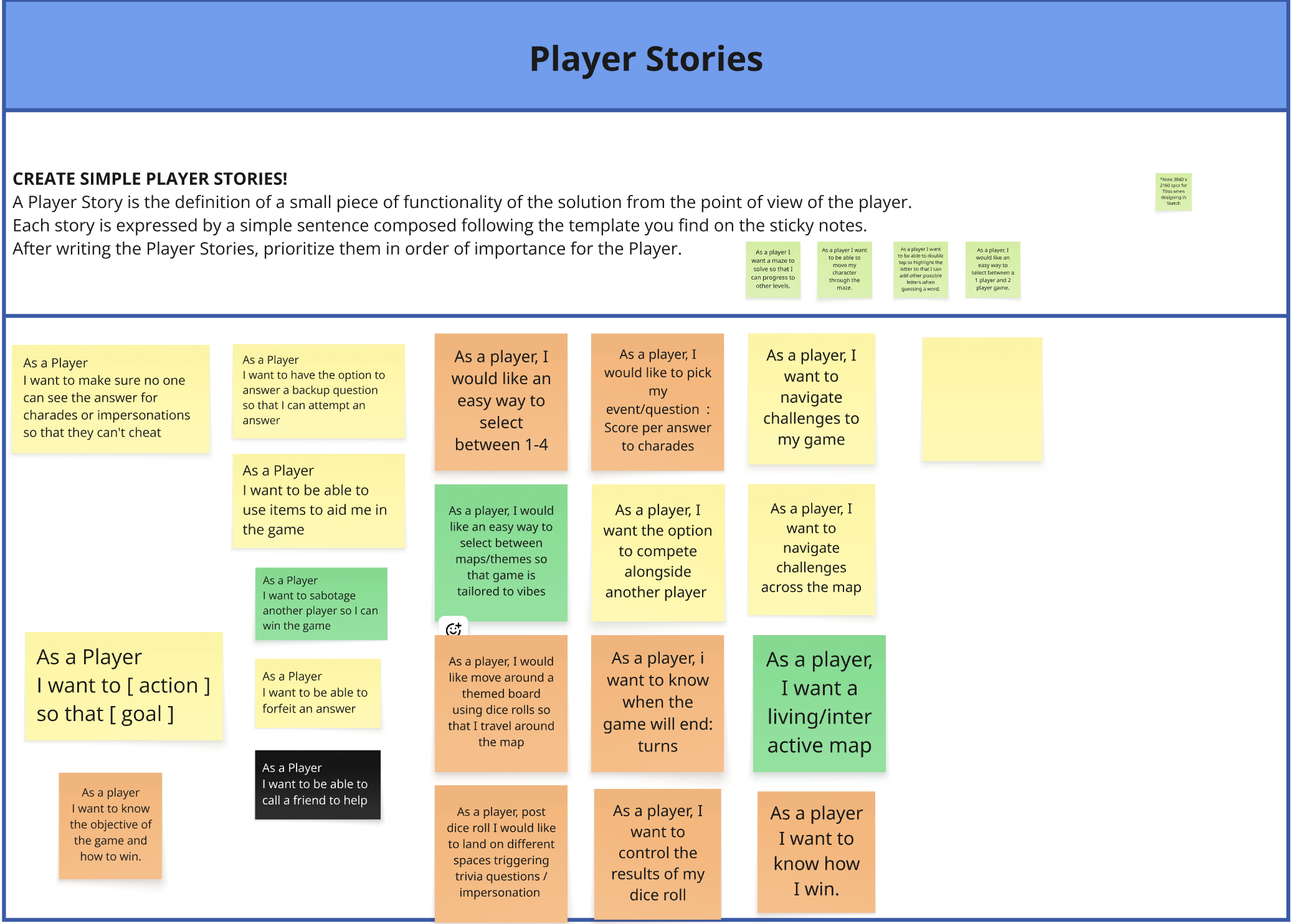
I was responsible for steering the ideation phase, constantly evaluating what ideas and features had payoff for users and were feasible with our timeline.
Kanban Boards
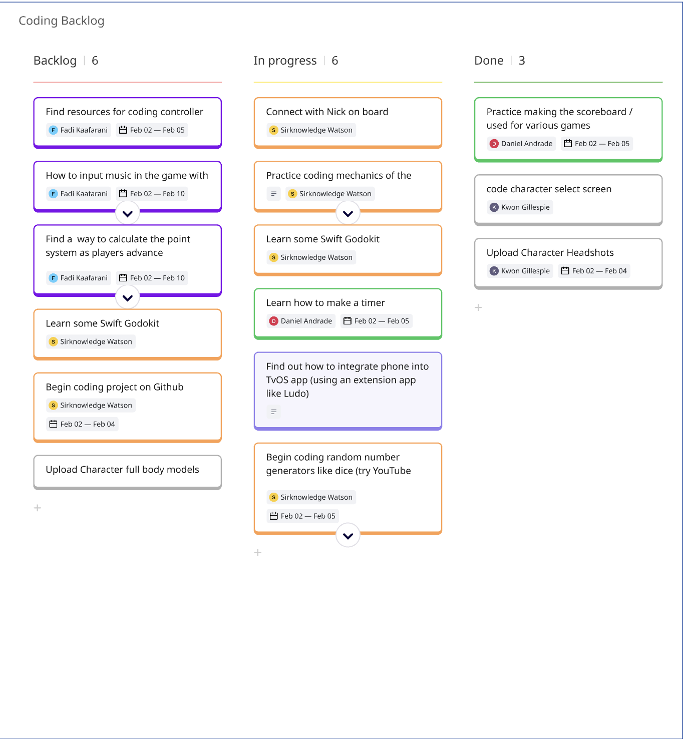
To ensure the team executed the steps needed for the final deliverable in the right order, I managed the Kanban boards for agile project management.
In the Research phase of our project, the co-manager and myself conducted trials using prototypes of the mini games designed within RCP to get user feedback and refine design.
As the Lead UX/UI Designer. I did the wire-framing, led the branding, created many of the in-game assets, designed the map and designed the user interface.
I also illustrated the storyboard and created the promotional video.
Lead UX/UI Designer
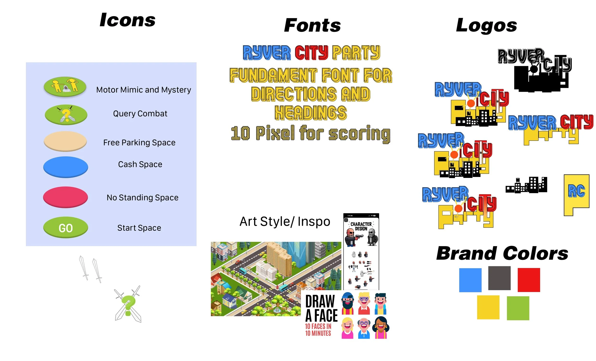
Style Guide
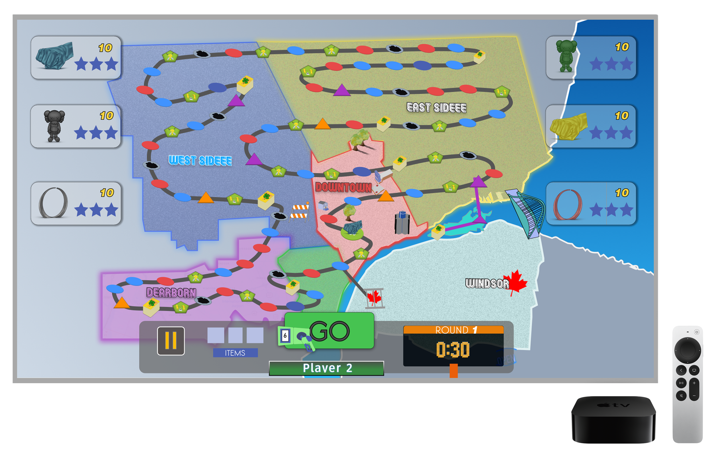
I was the sole designer responsible for designing the map and UI. Using Sketch, I made at least three different iterations of the map and UI panel before settling on the final one designs. I also provided the developers with annotations so they could understand the functionality.
The Game Assets and minigame designs and experiences
Using Sketch and Procreate, I was the designer behind the mini games UI and design, the map’s components, the flow of the mechanics, and the logo, while my co-designer was responsible for the design of the player pieces and corner store items.
As Lead Designer, I took the initiative to draft assets for our game and brainstorm brand components like font and colors. With feedback from peers and fellow cohort members, I was able to finalize brand style, icons, and logos that fit the team’s vision.
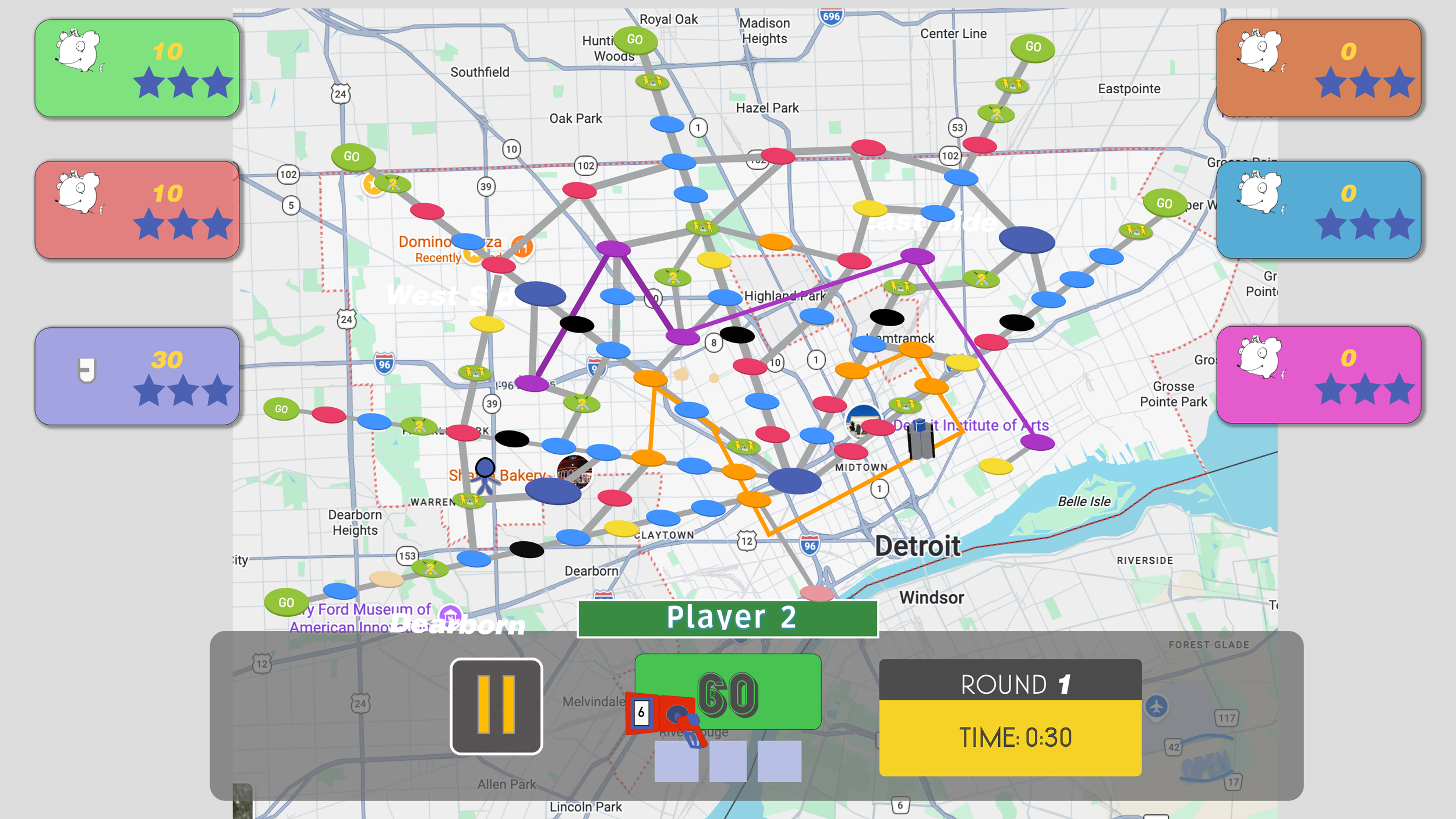
The Map and UI
Storyboard
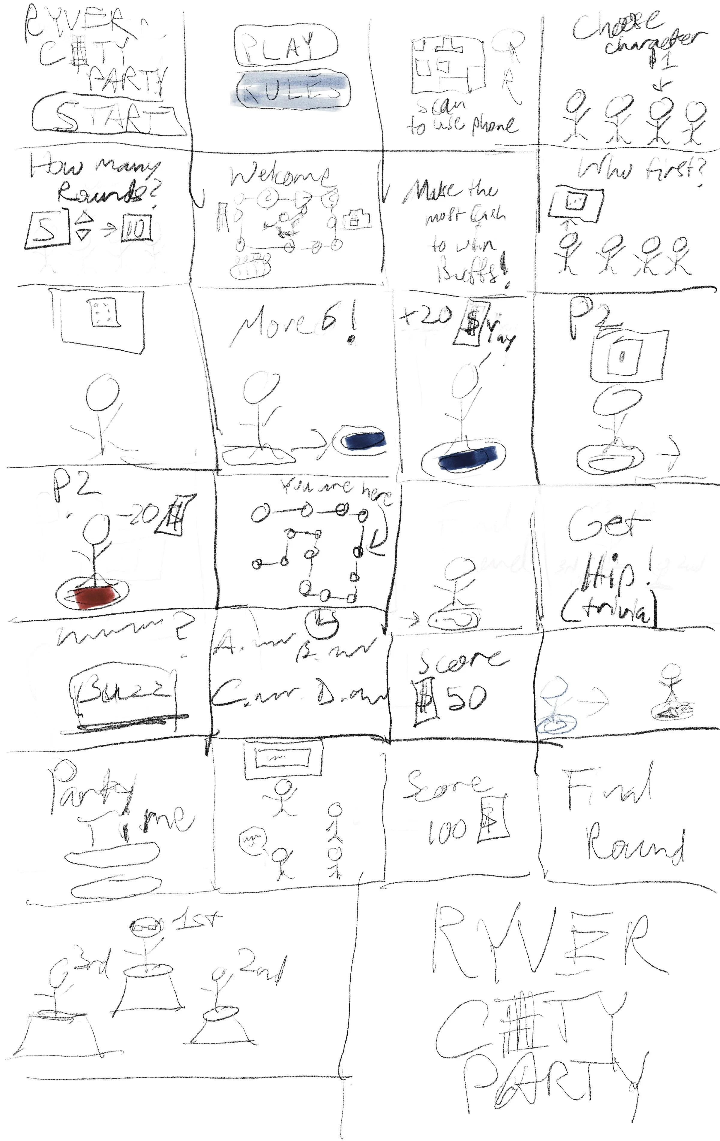
As Lead designer, I analyzed our early game concept to build a storyboard that conveys the essence of our game’s experience.
Project FAQs
What was challenging about the project?There were many ideas we had as a team and as individuals. Considering that one of our coders in round one of development had no coding experience, they were very intimidated by the scale of the project. My challenge was maintaining morale, pushing the team to do their best, and managing the different personalities.
What did you enjoy about the project?I enjoyed the theme of the project. As someone who was an avid gamer in youth, it inspired me to take a closer look at design decisions made in some of my favorite games and capture what made me love them so much.
What di you learn from this project?I learned about tools of product management, what goes into game development, and how to drive a team of various personalities to a finish line.